The Bethel Hub
Problem: There are too many different ways that students at Bethel receive or can find announcements about what is happening on or off Bethel’s campus. The final website mockup had to be within the Bethel brand guidelines. I had to consider faculty and students when creating the website for usability and how to get the knowledge of a new website to everyone on Bethel’s campus. We also considered labor costs for the creation of the website.
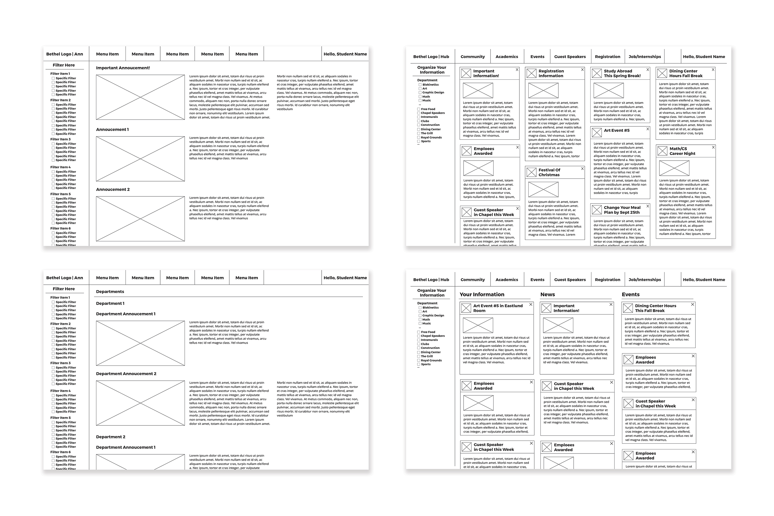
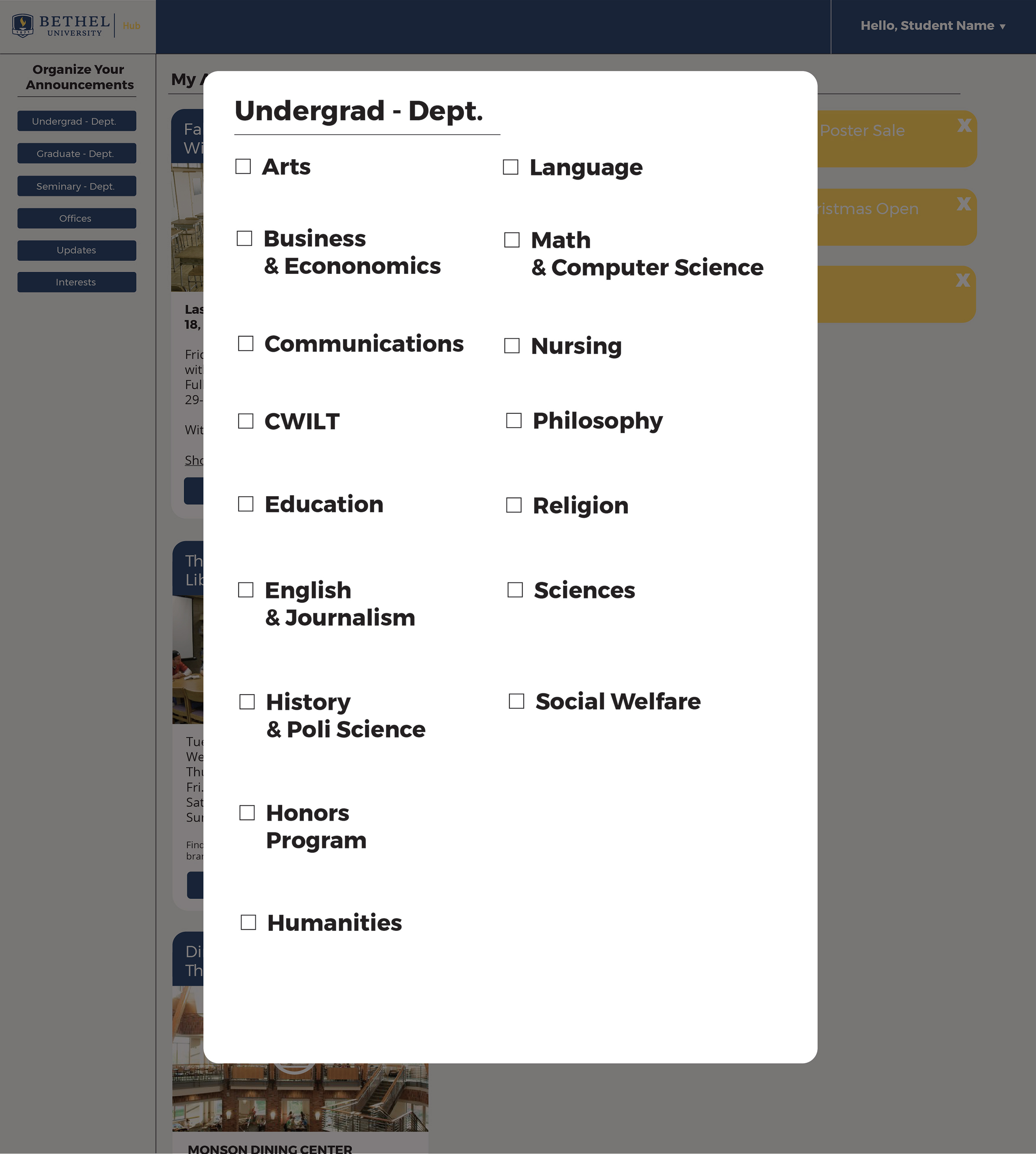
We started this project by brainstorming a problem on Bethel’s campus. Once we figured out our problem we brainstormed solutions by using post it notes. We also talked to different departments at Bethel to figure out viable solutions and sent out surveys to students to see what channels they used to find the information they needed. We found out that many people used email or their PO boxes to hear about announcements at Bethel. After research and interviews we came to the idea of the Bethel Hub. This would replace the current student portal website, Blink, since this website has an unappealing look and it is difficult to navigate and find what you need. We did visual research on websites; looking at Bethel and non-Bethel sites. We settled added a filtering system since there are many announcements that only concern a certain group of students. With filters, students would be able to see only what they want to see.
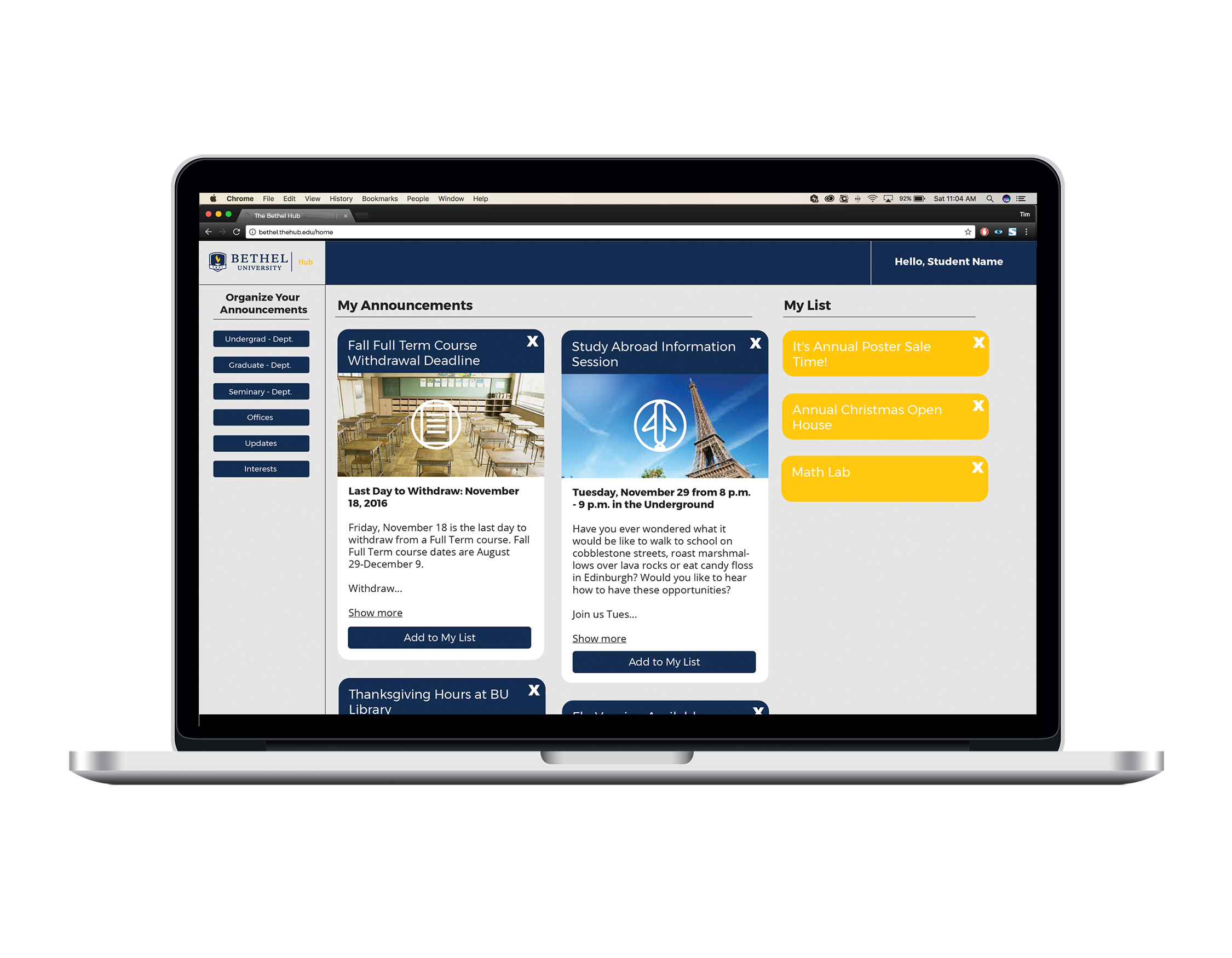
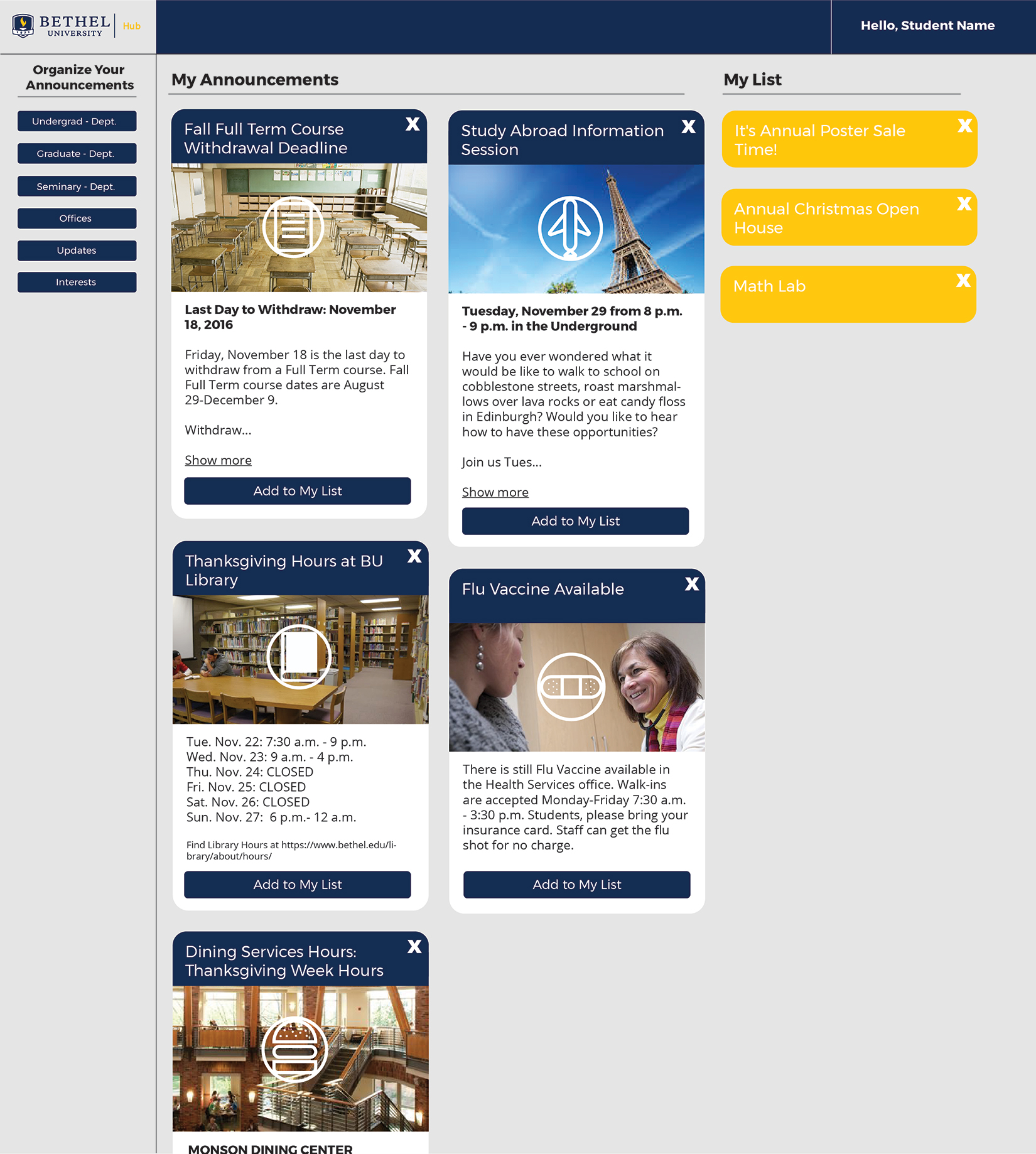
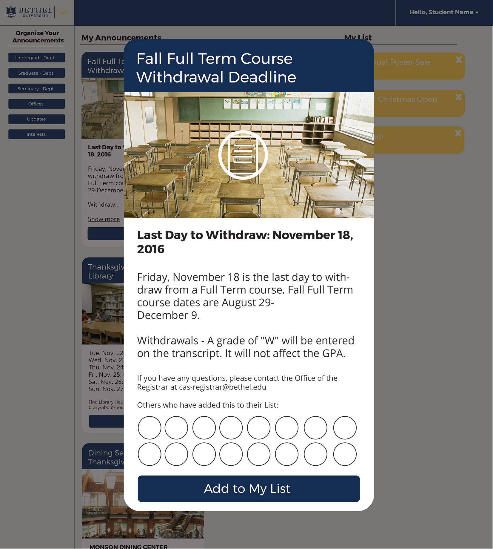
Our solution was to build a website that condensed all student related information into one place, a hub for all students, the Bethel Hub. We prototyped our first set of mockups for the website and continued to change our solutions until we found the best one.
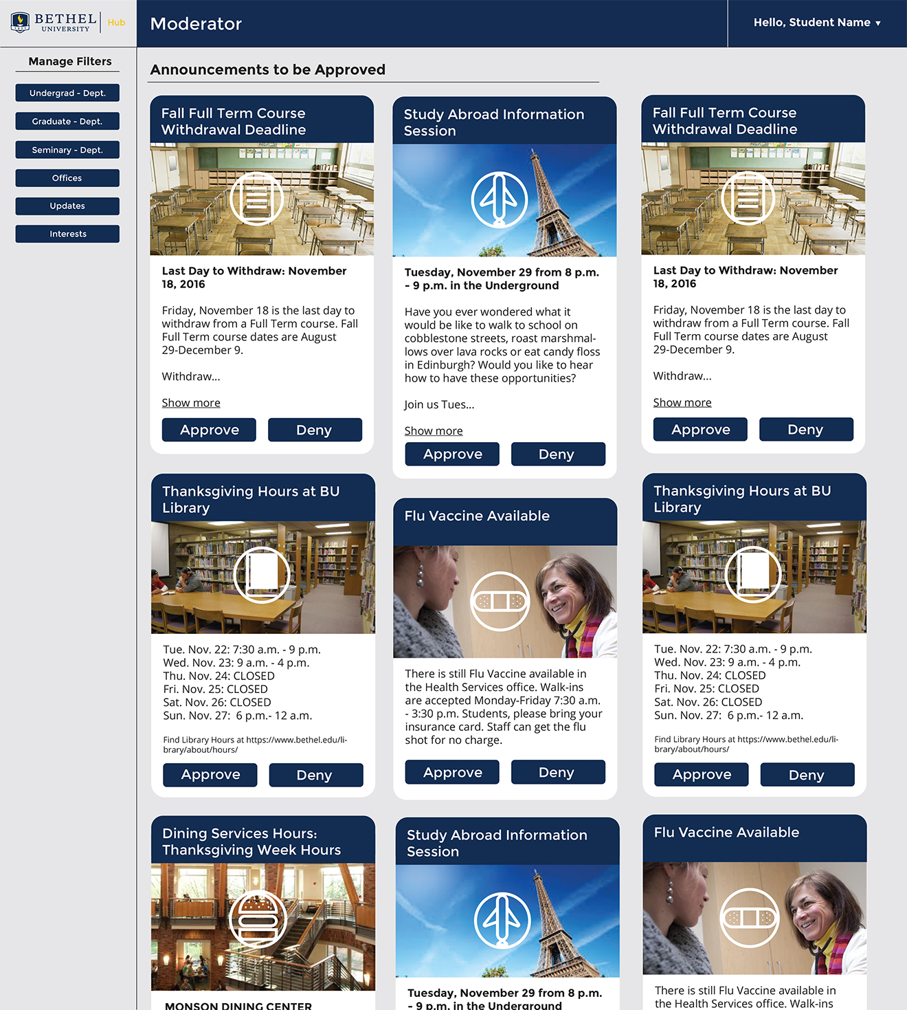
The final website included a personalized homepage that students could manipulate with filters. It also included functionality that created a user-friendly environment. There is a moderator page for managing and regulating the events or announcements. We decided to make a separate poster for faculty and the students to spread awareness of the new website.